


In Refactoring UI, Adam Wathan and Steve Schoeger warn that Tailwind color palette design is more art than science. But I haven't gotten the results I need from online color generators, so let's see what we can do with a little Python data science!
The Tailwind UI component library let me redesign https://myhuongkitchen.com in a hurry, but transforming its logo's bright red (#ed1c24), olive green (#4b7520), and navy blue (#084272) into light-to-dark color ranges was a challenge. Every time I tried colors from a generator, the Tailwind UI components' well-thought-out contrast ratios seemed to disappear. As an extreme example, try putting white into Shades Generator -- #ffffff is duplicated from shade 50 to shade 500, and shade 900 isn't very dark.
The Tailwind team has done a lot of manual tweaking of hue, saturation, and lightness in their colors to keep perceived brightness consistent around the color wheel, manage saturation at light and dark extremes, and ensure good contrast among the shades of a color. In this article, I use Python to reverse engineer intuition into raw numbers.
Outline
Get ready — this is a deep dive! Here's what we'll cover:
- Source code
- Discovering patterns in the charts
- 3 ways to apply patterns:
- Inserting your brand into an existing Tailwind palette
- Making a custom color that is properly Tailwind-like
- Using math to successfully find-and-replace colors in components from libraries
- Recap: perceived brightness is key (spoiler alert!)
Charts and code
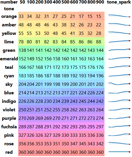
After extracting official Tailwind colors from its source code as JSON:
- I ran all 170 non-gray color definitions through Python's Colour module to extract each shade's hue, saturation, and lightness values (HSL).
- I computed each shade's perceived brightness using the
sqrt(0.299 * R^2 + 0.587 * G^2 + 0.114 * B^2)formula.
Then I graphed the results using Python's Pandas, Matplotlib, Seaborn, and Sparklines modules.
It sounds like a lot of tooling to learn, but in this case, I was just using Python to imitate Excel pivot tables and charts, so I didn't need to be very good with any one library. In fact, I mocked up everything in Excel before researching how to generate each chart in Python.
All charts
Visit Tailwind CSS Color Analytics for a full display of the math behind Tailwind colors.
The site includes achromatopsia-friendly charts, in case you find the diverging red-blue scales in this article hard to read.
Source code
Want to run analytics yourself? Check out the source code.
Patterns found
Hue #1
Hue isn't everything when it comes to making color ranges look distinct from each other.
- For example, my eyes find the 20-degree difference between Tailwind's
pink-500(hue330) androse-500(hue350) less prominent than the 13-degree difference betweenviolet-500(hue258) andpurple-500(hue271). - Some Tailwind color ranges overlap each other's hues, such as
blueandindigo.
These patterns — or rather, the lack thereof — lead me to believe that a lot of Tailwind colors' "special sauce" is found in saturation and lightness.
Hue #2
Here's a great pattern I wouldn't have recognized by eye, though: Within a color range, sparklines reveal that hues rarely stay steady. Hues tend to rotate around the color wheel, by a few degrees to a dozen degrees, as the shades proceed from light to dark.
- Counterclockwise for "warm" color ranges like
rose,orange,amber, andyellow. - Clockwise for "cool" color ranges like
limethroughpink.- (With the exception of "
sky", which begins counterclockwise as it gets darker, then turns around clockwise and doesn't quite return to where it started).
- (With the exception of "
Saturation #1
The most striking pattern among Tailwind colors is that they're quite vivid. Saturation barely drops below 50%. For some colors, saturation never drops below 75%.
If your brand's colors weren't designed in the last 10 years, you might find that they're a lot less saturated than the colors that ship with Tailwind.
Saturation #2
Overall, saturation drops as each Tailwind color range works its way from light to dark.
- Several greenish and reddish colors are also desaturated at lighter shades or even across all shades.
- (Personally, my eyes find
#00ff00,#ff00ff, and#ff0000a bit more alarming than other "basic" hex codes like#0000ff, so maybe they're simply washed out on account of day-glow green, magenta, and red feeling "intense" to many people.)
- (Personally, my eyes find
- I'm really not sure why
indigodrops so much more dramatically in the700-900shades than other colors, but it's notable that it does.
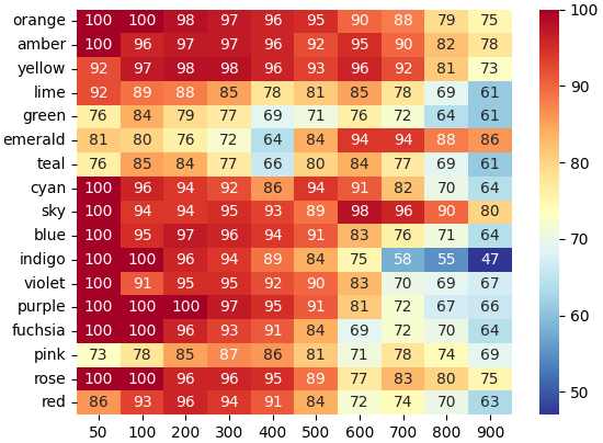
Visit https://tailwind-color-analytics.netlify.app/ for an achromatopsia-friendly chart.
Lightness and perceived brightness #1
It goes without saying that lightness drops as shades proceed from light to dark.
What's interesting is how it drops. Many human eyes perceive yellows and greens as naturally "brighter" than blues of the same lightness.
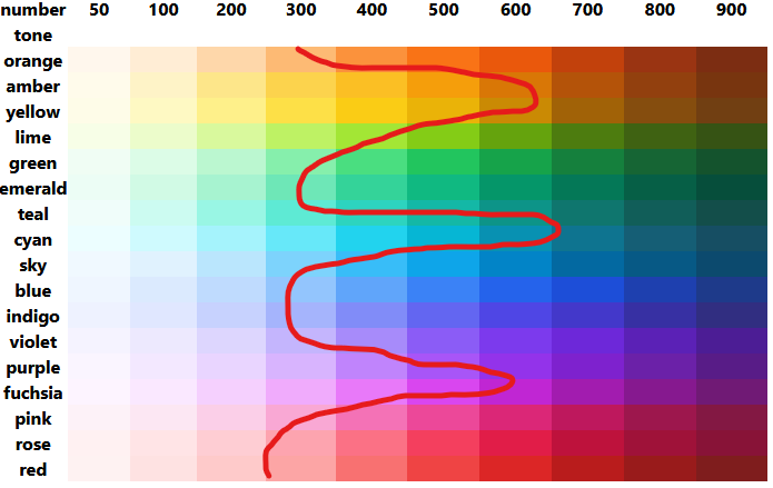
Do you see a "squiggle" of brightness when you look at Tailwind colors? I do.
To counterbalance this, Tailwind yellows and greens have "darker darks" (measured in "lightness") than Tailwind blues and purples.
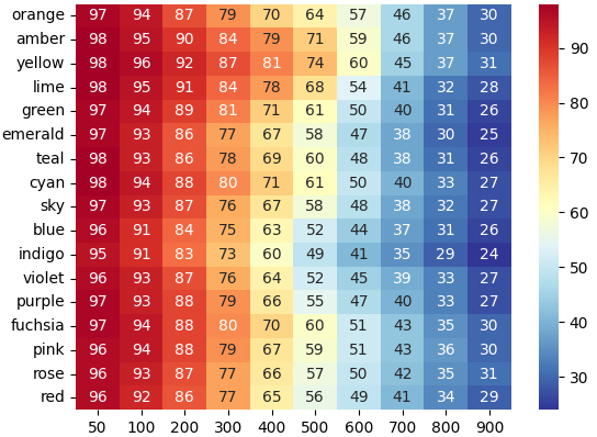
A perceived brightness chart shows that while yellow still steals the show on perceived brightness and indigo is still moody, the -50 , -500, or -900 shade for any one color range feels relatively equivalent to that of another.
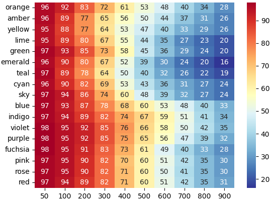
Lightness and perceived brightness #2
A crucial pattern that makes color ranges feel "Tailwindey" is that lights are never washed out beyond 98% perceived brightness and darks simply aren't very dark. (Indigo, the darkest, has 24% perceived brightness.)
Practical pattern application
"Be careful mixing reds," my mother warned me as I learned to dress myself.
With 17 million RGB colors in existence, and only 170 in Tailwind, surely I'll have to develop palettes by hand for My Huong Kitchen, right?
Insert your color into standard Tailwind — or just use it to choose colors
It turns out I don't. Here's how the three break down by HSL and perceived brightness:
| Tone | Hex | Hue | Saturation | Lightness | Perceived Brightness |
|---|---|---|---|---|---|
| Red | #ed1c24 | 358 | 85 | 52 | 52 |
| Green | #4b7520 | 90 | 57 | 29 | 39 |
| Blue | #084272 | 207 | 87 | 24 | 25 |
My first step, before trying to make my own palette, is to see how closely my colors "fit" into the colors shipped with Tailwind 3.0.
- Huong Red's hue is only 2 degrees off from Tailwind's entire
redrange, is saturated about likered-500(84) and has lightness likered-600(51) — but perceived brightness betweenred-400(65) andred-500(56). - Huong Green's hue is just off the
-900end of Tailwind'slimerange, as is its saturation. However, its lightness is more comparable tolime-700(27), as is its perceived brightness (41). - Huong Blue's hue is between Tailwind's
sky(198-204) andblue(212-226). It's saturated betweensky-800(90) andsky-900(80), but more likeblue-500(91) toblue-600(83). On lightness, it's equivalent tosky-900(24) and off the dark end of thebluerange entirely. For perceived brightness, it's just off the end ofsky-900(27) andblue-900(26), but not unheard of for a "cool" Tailwind shade.
Out of curiosity, in Excel I added the three Huong colors at the ends of the lime, sky, and red color ranges to see how they looked.
From the get-go, they looked surprisingly better than I would have guessed when looking at Tailwind docs!
Next, I decided to see how "at home" they looked in native Tailwind ranges by pasting them over what seemed to be their most similar mathematical companions, red-600, lime-700, and sky-900:
Can you find them?
Again, they fit in a lot better than I expected. The main color that looks "out of place" no matter where I put it is the red.
I validated this by using Tailwind Play to try the default definitions of red, lime, and sky with some free components from Kitwind Kometa:

I think Mom would approve of my "coordinating reds."
As for sky — it's not perfect, but like Adam and Steve said in Refactoring UI — "nobody ever complains about blue." (Also, as a Refactoring UI customer, I have access to more of their hand-designed color ranges, which include some nice desaturated blues that match very well.)
DIY Tailwind color range
However, while playing with Kometa, I noticed that I constantly I felt compelled to use darker greens. Something didn't quite look right about lime-300 anywhere near the restaurant's logo.
Maybe the lighter shades of lime simply felt too neon, too urgent. The site is for a restaurant, not a startup. I want to convey relaxation and digestion, not FOMO.
So I'll bring you along as I make my very own Huong Green palette to replace lime with.
Overview
Here's the TLDR for building a custom Tailwind color range:
- Pick a "close" Tailwind color by hue.
- Substitute in your branded color to its best-fit spot. Leave it alone. Consider the rest of the colors "unbranded shades" and candidates for editing.
- Adjust hue on all unbranded shades by the difference between your brand and the shade it replaced.
- Adjust saturation on any unbranded shades that "look wrong" to better fit the mood of your brand color.
- Tip: Start by trying corresponding saturations from similar Tailwind or Refactoring UI colors, not by blindly adding or subtracting a constant value.
- Adjust lightness on unbranded shades until perceived brightness values are close to the Tailwind original.
- Repeat HSL tweaking, holding perceived brightness close to originals, until you're visually satisfied.
- Tip: Make sure to view your color palette through various colorblindness simulators.
Setup
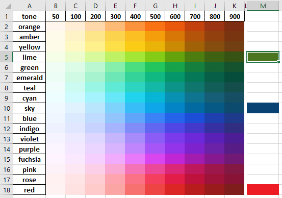
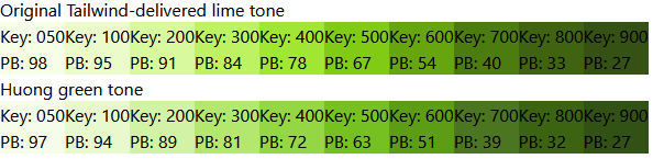
First, I wrote HTML that laid out all ten shades of Tailwind lime, defining them by HSL.
Then I copied and pasted that HTML and labeled it "Huong Green." I manually replaced the 700 position with hex code #4b7520 and wrote myself a comment saying not to touch it.
Adjust all hue of an existing Tailwind color range by a constant
For all Huong Green colors, I raised the hue of every shade by 4, because #4b7520 (90) is 4 degrees clockwise of lime-700 (86).
That made everything bluer, so most shades got "darker" than their lime siblings.
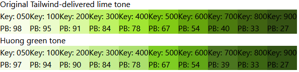
Adjust saturations. Mimic a similar color that better matches your mood.
Huong Green, #4b7520, is much more desaturated than lime-700, so I'd like to bring down all saturations ... and bring up the lightness a bit to compensate and hold "perceived brightness" steady with the original Tailwind lime.
The neighbor of Tailwind lime, green, is pretty desaturated in the mid-ranges, and emerald is, too. On the principle that Tailwind's designers know more about color than I do, I used these colors as a template for my first round of desaturation.
I changed the saturation of each Huong Green shade's between 50 and 600 to match the corresponding green or emerald — whichever had a lower saturation.
That's calmer, but now it's quite dark.
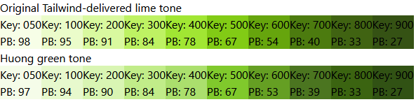
Adjust lightness to achieve Tailwind-like perceived brightness.
Next, I raised lightness for each shade of Huong Green (except 700) until the perceived brightnesses was within a reasonable range of the corresponding perceived brightness for Tailwind lime, green, or emerald.
I liked that better, but I still found the 500 and 600 a bit too vibrant.
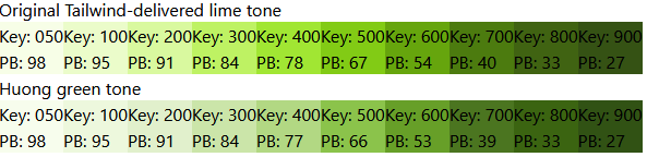
Test in real components
I reduced the saturation on those two until I felt "happy," raised the lightness until perceived brightness matched original Tailwind colors, and repeated the process until things felt good to my eyes.
Once I reached the point where things felt good, I needed to see it in context.
I added a custom configuration to Tailwind Play to override the definition of lime with my new colors and changed the components to use some of the lighter greens that had previously seemed inappropriate.
module.exports = {
  theme: {
    extend: {
      colors: {
        lime: {
          50: 'hsl(82, 76%, 95%)',
          100: 'hsl(84, 80%, 89%)',
          200: 'hsl(85, 76%, 83%)',
          300: 'hsl(86, 72%, 73%)',
          400: 'hsl(87, 64%, 65%)',
          500: 'hsl(88, 64%, 48%)',
          600: 'hsl(88, 64%, 38%)',
          700: '#4b7520',
          800: 'hsl(90, 71%, 23%)',
          900: 'hsl(92, 61%, 20%)'
        }
      }
    }
  },
  plugins: []
};
Disappointing — I thought I'd designed a perfect color range, but it turns out that these greens are still vibrant in a way that's disconcerting to me.
Continue playing
Out of curiosity, inside the Tailwind configuration, I lowered 200's saturation from 76% all the way down to 55% and 500's from 64% to 50%. Suddenly I felt like things were on the right track:

Make final intuitive adjustments, keeping perceived brightness Tailwind-like
Back in my HTML playground, I did another round of lowering saturation and raising lightness to keep perceived brightness steady.
module.exports = {
  theme: {
    extend: {
      colors: {
        lime: {
          50: 'hsl(82, 80%, 96%)',
          100: 'hsl(84, 65%, 92%)',
          200: 'hsl(85, 55%, 87%)',
          300: 'hsl(86, 53%, 78%)',
          400: 'hsl(87, 52%, 68%)',
          500: 'hsl(88, 50%, 53%)',
          600: 'hsl(88, 60%, 39%)',
          700: '#4b7520',
          800: 'hsl(90, 71%, 23%)',
          900: 'hsl(92, 61%, 20%)'
        }
      }
    }
  },
  plugins: []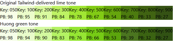
};Back in Tailwind Play, I felt relaxed by my new color palette.

Success! I built a custom "Huong Green" color range around #4b7520 that looks much more "Tailwind-ey" than anything I could have created with an online generator.
I feel comfortable substituting all ten shades of huong-green into prebuilt component libraries whose look and feel were designed around native Tailwind color schemes.
Find-and-replace with science
I mentioned Kitwind Kometa as a great free component library, but you should know that their components ship using color ranges they designed whose numbering systems do not conform to the relatively stable perceived brightnesses you'll see out of the Tailwind team.
Analyze the component library's colors
Kometa's components look great if you don't change the colors, but I don't recommend simple find-and-replace operations between their colors and the ones built into Tailwind. Kometa's idea of a -400 is often much darker than Tailwind's idea of a -400, with respect to perceived brightness.
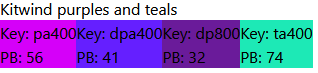
See if find-and-replace by name suffices
Let's walk through an example on Tailwind Play.
Here's a screenshot of the original component:
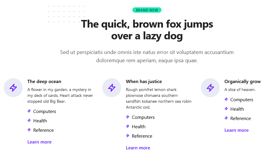
Stylistically, I decided I'd like to try the following replacements:
- Kometa's
teal-accentwith Tailwind'ssky - Kometa's
blue-graywith Tailwind 3.0'sslate - Kometa's
indigo,deep-purple, anddeep-purple-accentwith myhuong-green
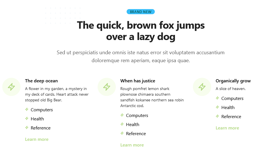
I tried simply doing these find-and-replace operations by color name, but the huong-green-400 links came out difficult to read on a white background:
Find-and-replace exact shades by perceived brightness
Perceived brightness to the rescue.
Looking again at the perceived brightness values for Kitwind's exact colors used in this component, I was able to come up with a much better find-and-replace pattern for vibrant colors by choosing a "number stop" from my intended palette that kept perceived brightness at Kitwind's original values:
- Kometa's
teal-accent-400with Tailwind'ssky-300 - Kometa's
indigo-50with myhuong-green-50 - Kometa's
deep-purple-800with myhuong-green-800 - Kometa's
deep-purple-accent-400with myhuong-green-700- (It was a pleasant surprise to have
#4b7520itself end up the default link color.)
- (It was a pleasant surprise to have
Adjust the component to your own accessibility standards
Now I could read the links, but once my "link hover state" became a transition between 700 and 800 of the same color, I realized that Kometa's "hover state" had never been visible enough for my tastes in the first place.

Believe it or not, "Learn more" is in two different shades of green.
I replaced transition-colors duration-200 hover:text-emerald-800 with special-underline and added the following CSS to Tailwind Play:
@layer utilities {
  .special-underline {
    @apply bg-gradient-to-r from-sky-200 to-sky-200
      bg-no-repeat [background-position:0_88%]
      [background-size:0%_0.2em]
      motion-safe:transition-all motion-safe:duration-200
      hover:[background-size:100%_0.2em]
      focus:[background-size:100%_0.2em];
  }
}Now the link color stays the same on hover or focus, but a sky-200 underline appears beneath links to indicate the state instead. It grows from left to right when motion-safe browser settings are detected. (You can read more about this code at Growing link underline, in Tailwind CSS.)
Validate the components
Here's a screenshot of my component with colors replaced by perceived brightness, not just name:
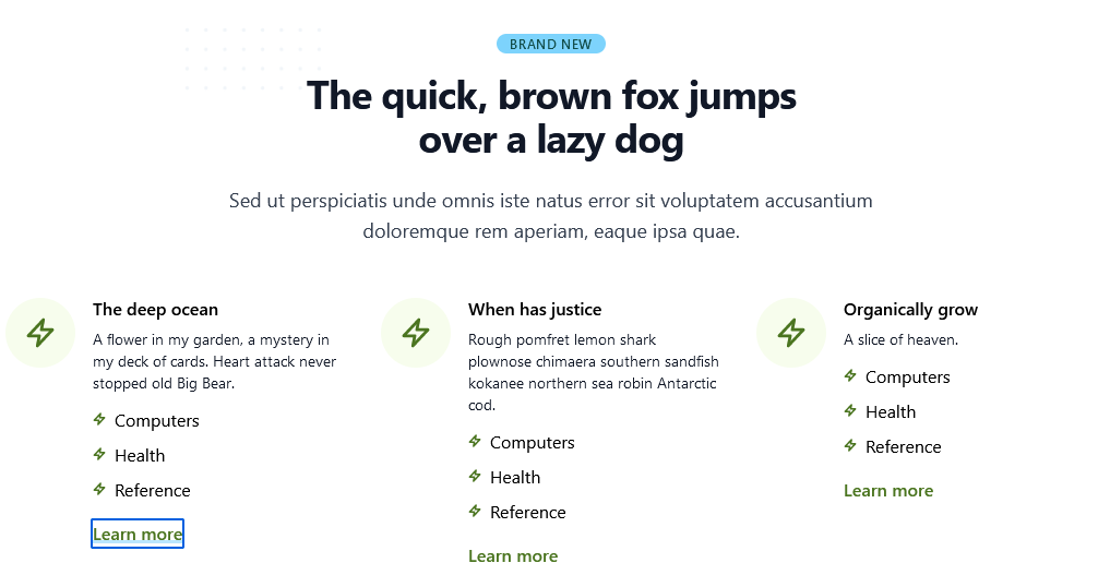
Everything feels easy to read, and I'm still happy with how relaxing huong-green looks.
Takeaways
If you're new to designing custom color palettes, you'll go far if you simply match perceived brightness — for any given hue — to the decisions made by the authors of Tailwind CSS.
Do the math
Next time you need to incorporate a branded color into a Tailwind site, compute its hue, saturation, lightness, and perceived brightness, and compare it to those of existing Tailwind colors.
Take the easy way out
You might be surprised that simply "slipping in" your color to its nearest neighbor in a default Tailwind palette makes your site feel more put-together than using a custom color range produced by an online generator.
Also, remember that you're not obligated to design a full 50 to 900 range for every color in your web site. I certainly don't use ten different reds for My Huong Kitchen, and many of Stackbit's starter components use a classic "primary" and "secondary" approach to naming color classes.
Imitate Tailwind's professional graphic designers
If simple replacement isn't quite right, adjust unbranded shades in the color range by hue first.
Then play with saturation and lightness, and maybe hue as needed.
When everything "looks right" (including a11y double-checks) and also bears perceived brightness values close to the original Tailwind color range, you're done.
Replace component library colors mathematically
Analyze the perceived brightness of any colors that come with component libraries. Not all 50 to 900 color ranges are built nearly as consistently as the ones that ship with Tailwind or the ones you're going to make with your new custom design superpowers.
When editing component library code, you may need to find-and-replace exact colors.