


Creating a site today means building for mobile. As most developers, designers and marketers likely know:
- Since 2018 most website visits have been from a mobile device
- Mobile traffic has an annual growth rate of 46%
- Mobile commerce is expected to drive almost 50% of ecommerce sales by 2022
But we don’t build websites on our mobile devices. We develop websites and content primarily from our laptops, spending hours making sure things look just right on our computer monitors. We are then faced with making sure it looks good on much smaller screens.
The most common approach to previewing a mobile view is using the in-browser developer tools. Right mouse click, inspect element and you get a limited set of device views you can emulate. Developing locally, you can do this against a local preview, which is great while working on a new design or feature. But this is not a good approach for less technical folks, who don’t have a local development environment. Marketers who write content in a CMS admin screen without a preview can’t use this tooling either without additional work.
The other common path is deploying the site and then checking it out on a mobile device. Developers can set up staging deployments and preview URLs, but for less technical folks deploying to the production environment is the most available option. However, this can bring risks, like exposing content that might not be ready for prime time. And if there is an issue, you are going to need to wait until the next deployment to see if it has been fixed. This is generally a slow and frustrating process.
For most people working on Jamstack websites, they just want to see what our design and content changes look like on a real device with less complexity.
New Tools for Previews on the Jamstack
Wouldn't it be great to have a handy tool that shows you instantly what your site will actually look like on mobile, without deploying or using emulators? We thought so too.
Stackbit Studio now offers two ways to easily check for mobile responsiveness on your real device:
- Send yourself, or anyone else, a Share link and view from any device
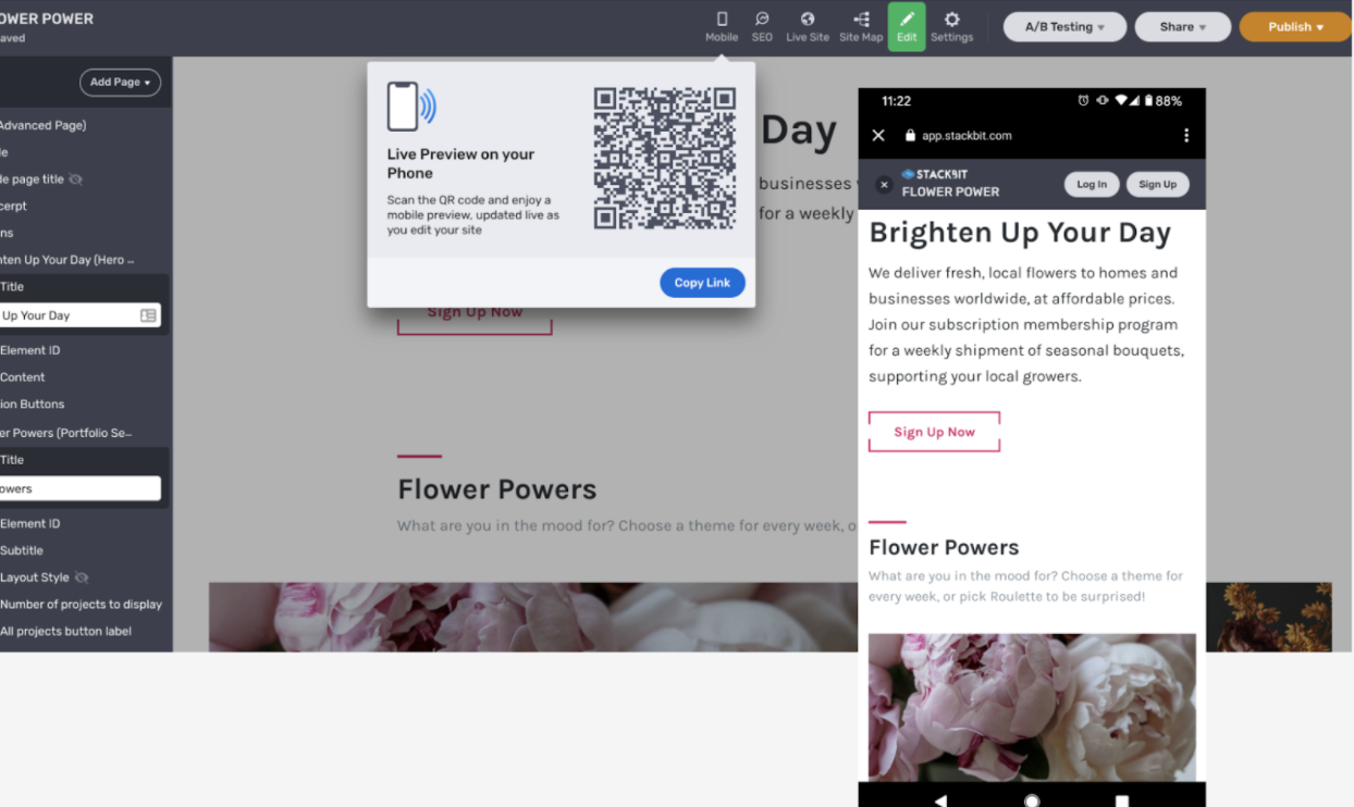
- NEW Scan a QR code right from the Studio.
Stackbit Studio users have been leveraging the Preview link option in the Share menu for a while now. Simply copy the link and send it to anyone to give them a view of your current work. This will work on any device but you need to pass the link.
The new mobile preview makes it even easier to view your site on a mobile device. Just open the Mobile menu, scan the QR code with your phone and instantly see a live preview of the site you are actively working on.
This is really handy for:
Designers who want to make sure that their work looks great on mobile
Developers to make sure the site looks and behaves on mobile as intended
Marketers who are changing texts and need to see, in real time, what their edits look like on mobile
Making the Jamstack more Mobile Friendly
We want to empower marketers, designers and developers with the right tools to deliver truly responsive, beautiful Jamstack websites. This goes beyond this mobile preview. We try to deliver on this with all of our features.
This is why all of the pre-integrated themes in the Stackbit Site Builder are responsive, right out of the box. And because our themes work with common static site generators like Gatsby, Hugo, Jekyll and more, you are free to leverage the tools you like while making the internet awesome.
Get Building for Mobile
We believe Jamstack is the future. Website builders should be able to get the best results without having to wire it all up themselves, by themselves. We hope our new mobile preview makes your website building experience a little easier.
We are always looking for ideas that will help make a more responsive, accessible web. Feel free to let us know how we can help.
Happy Building. Most of the people who visit your website probably do so on a mobile device. But you work on your site on a desktop or laptop. We’ve added a super easy way to preview your site on your actual mobile phone… without typing a single character!