


Beginning with a Plan
If you jump right in and begin writing code, you’re likely to encounter more bumps along the way and end up rewriting the code, perhaps even multiple times.
A plan is crucial to keeping your code concise and your time focused.
Building with Components
Many websites today are built with components. Components are reusable pieces of code that can be composed to create web pages.
Components are a great way to approach building a website because they enable you to reuse work you’ve done before. Thus, development of the site speeds up over time. And maintenance tends to be easier, as every component has a single source of truth. So if there’s a bug with that component, you generally only have to fix it in one place.
Building a Component Plan
Building such a plan requires that you step back and look at the entire system — the largest context in which you’re working, which is usually the whole site, but may be a single page.
So let’s do it! We’ll walk through the process of taking a design for a single page and breaking it down into components. What we’ll be left with is a blueprint for how you will build that page.
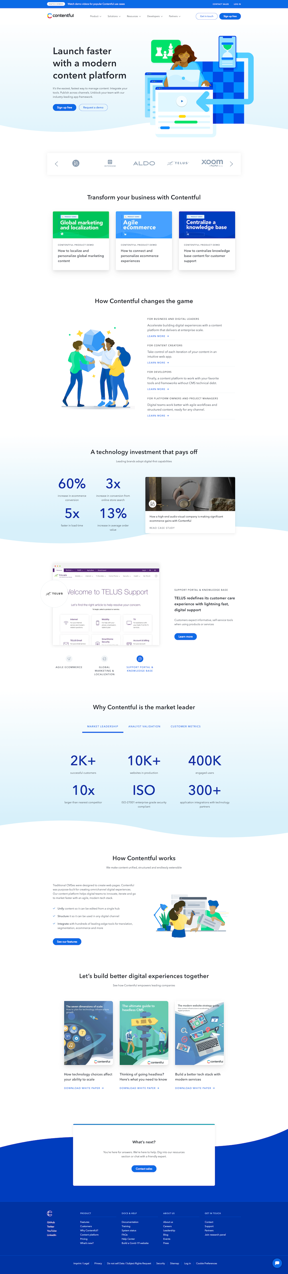
And let’s use a real world example — Contentful’s home page. (In this case, we’ll assume we’re working with a single-page site and not worry about the broader design system.)
Here is the design we’ve been given:
And now let’s make a plan.
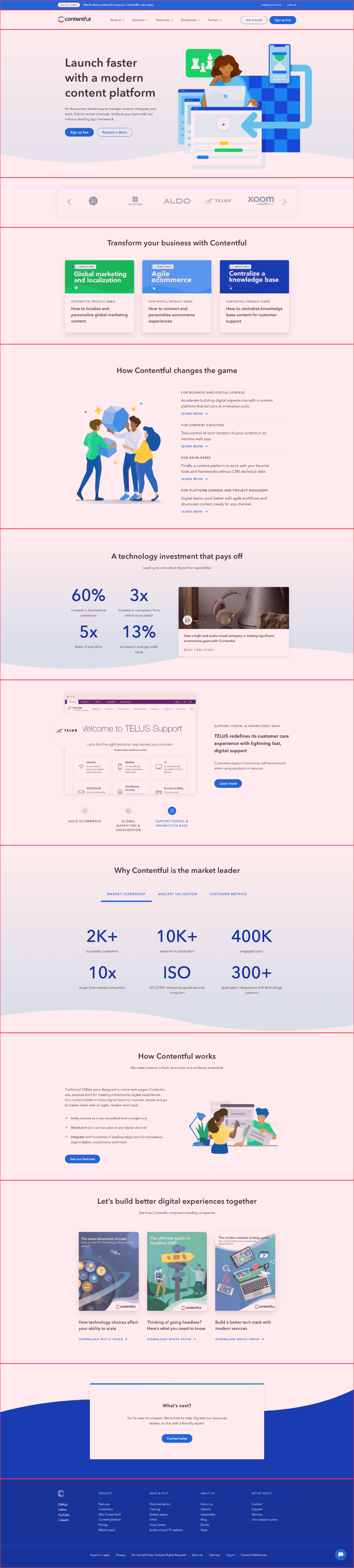
1. Identifying Sections
The typical website can be organized into section components. A section spans the full width of the page and includes related content.
The distinction between sections is usually obvious. A well-designed page provides visual breaks that you should be able to pick up on naturally. Your eye will often tell you where a break should be.
Here’s how I would break our design down into sections. Each section is outlined in red:
When Elements Span Multiple Sections
In some cases, there may be elements like background images that blur the lines between sections. If that happens, it should be a warning to you that writing the code will be a little trickier and more time-consuming.
This can be handled in a jam session, which we’ll discuss in Step 5.
2. Naming Sections
Next, give each section a name. This helps create a common language for you, the designer, other developers, content editors, and stakeholders can refer to each section.
Structure Over Content
Naming is hard. There’s no perfect name for any section. But, one thing that has helped me tremendously in the past is to name sections by their structure, not the content.
Content can always (and probably will) change, while the foundational code and underlying functionality may stay the same. It’s much easier to avoid name changes every time you want to change the content.
This also provides flexibility in using a section in multiple ways.
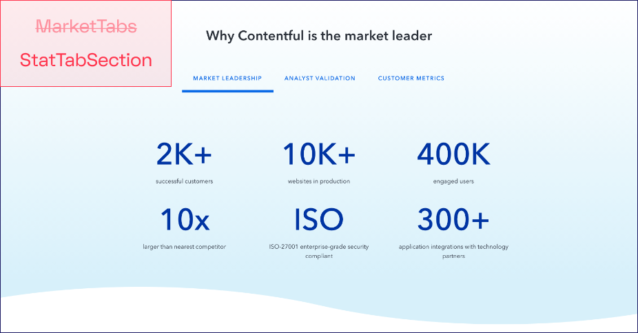
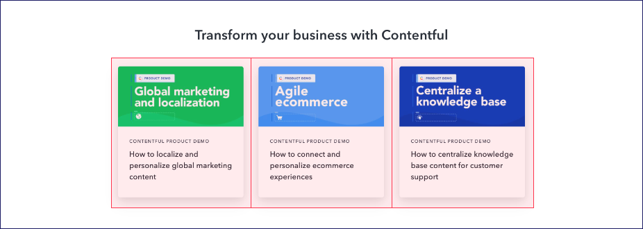
Here’s an example with stats about Contentful’s market position. We could call this section MarketTabs, but that could quickly become irrelevant. I’d choose something more generic and functional, such as StatTabSection.
3. Identifying Similarities
You have sections and names for each section. Now, take a step back. Look for similarities in structure among sections, regardless of the name you chose.
And don’t just consider direct copies, but be open to small differences.
For example, here are two sections that fit well together as CardSection. The first has a heading and three components we’ll call cards. Each card has a label, heading, subheading, body text, and background image. The second has a subheading and slightly difference cards, where the image is positioned differently and there appears to be a link at the bottom.
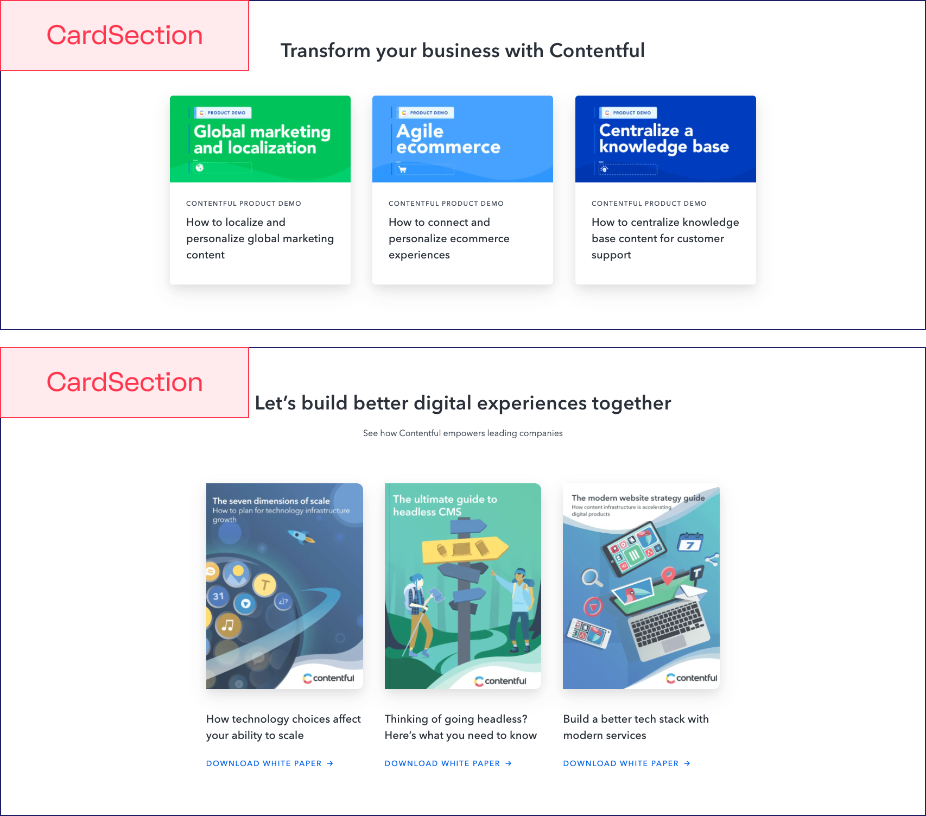
All of these adjustments can be made conditionally and relatively easy in the code. We might consider these two be two different card types in these sections, and those may map to different components, but that’s all configurable. That’s something we could surface to editors as an option in our CMS.
4. Drill Down into Blocks
Sections can then be further broken up into what we call blocks at Stackbit. These are smaller, repeatable components.
Looking Within a Section
It’s easiest to start by looking for repetition within a section. Using the example above, we already identified that a CardSection has card components inside, which I might describe as CardBlock.
Looking Across Sections
The slightly more difficult task is to look for similarities across sections. This can be more difficult, designers might make small adjustments to components that could otherwise be shared.
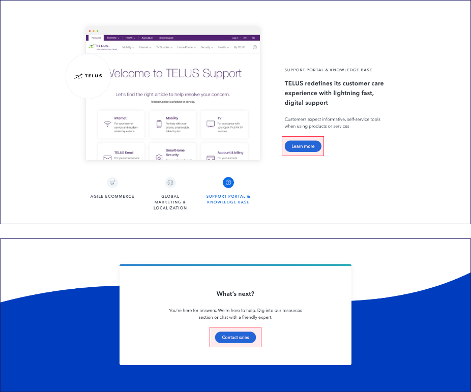
The classic example of a component often shared among sections is a button. Here’s an example with a button in multiple sections.
5. Make Adjustments
Once you have a general component plan in place, it’s an opportunity to make adjustments through jam sessions. A jam session is a meeting with the designer meant to clear up ambiguity and find opportunities to adjust the design to speed up development.
Jam Session Goals
Jam sessions are most effective when you bring a list of questions to the designer and work through them, one at a time. (See below for common topics.)
The goals of the session are to:
- Provide you with more clarity on the design, especially on interactive elements, which are difficult to show in static designs.
- Reduce development time by introducing more system-level consistency.
Common Jam Session Topics
Though there are many scenarios that arise
- Creating consistency in components used across sections and blocks. Example: Most sites should only have a small number of button colors and styles.
- Identifying stylistic challenges. Example: If a background image spans multiple sections, making it difficult to implement and make editable by content editors, you may look to either:
- a) make that background image the only one on the page and thus let editors set it at the page level,
- b) fit it within a section, or
- c) combine the sections into a single section.
- Identifying the behavior of interactive elements.
- Example #1: If you see a photo carousel, you should specify transition animation and control (arrow) behavior.
- Example #2: If hover states for buttons are not specified, give the designer a chance to determine before you guess while building.
Handling Disagreements
If the designer insists that a change you feel is crucial must remain as is, consider first consulting with another (senior) developer to see how they would build it. It’s possible they’d have some advice on how to build it quicker. For example, perhaps they know of a reliable library that has already solved the problem for you.
That said, disputes most often come down to time and budget, both of which are optimized by simplicity. As a developer, it’s your responsibility to work with the designer to find a balance between simplicity of the code and effectiveness of the design.
6. Think & Build System-First
Once you have your plan, and are fully clear on what you are to build, it’s time to dig in.
While writing code, it’s important to keep the plan in mind. Continue to build with the system in mind. Be consistent where possible. Use repeatable components when it’s reasonable to do so.
Every time you veer from the system and create an ad hoc solution, you make maintenance of the entire system more difficult.
Applying to the Real World
This was a simple example with broad steps on how to get started. Applying to the real world means more nuance and complexity.
When you feel overwhelmed by the volume or intricacy of the design, come back to these steps. Be methodical. Start at a high level and drill down. Work with the designer to clarify ambiguity and help streamline what you’ll have to build.
Seeing Components in Action
If you want to take at components in action and see the result of this process, head over to jamstack.new to create a free site, then dig into the code.
Or if you want to talk more about this process in general, let’s do it! I’m @seancdavis29 on Twitter and I’m a huge component nerd.
